For Week 50 of the R4datascience project, I used the provided diseases data mentioned in this SimplyStats blog post. The dataset contains state level data of vaccine preventable infectious diseases over the span of ~70 years.
Packages
#packages
library(tidyverse)
library(gganimate)
library(ggplot2)
library(grid)
library(sf)
library(usmap)
library(scales)
library(Hmisc)
Read in the diseases file
diseases<-read.csv(file="~/GitHub/TidyTuesday/data/2019/2019-12-10/diseases.csv")
View the dataset
diseases %>%dim()
## [1] 18870 6
The diseases dataset contains 18870 rows and 6 columns
diseases %>% colnames()
## [1] "disease"         "state"           "year"            "weeks_reporting"
## [5] "count"           "population"
The diseases dataset contains columns for: disease, state, year, weeks_reporting, count, state population
head(diseases)
##       disease   state year weeks_reporting count population
## 1 Hepatitis A Alabama 1966              50   321    3345787
## 2 Hepatitis A Alabama 1967              49   291    3364130
## 3 Hepatitis A Alabama 1968              52   314    3386068
## 4 Hepatitis A Alabama 1969              49   380    3412450
## 5 Hepatitis A Alabama 1970              51   413    3444165
## 6 Hepatitis A Alabama 1971              51   378    3481798
The first 6 rows of the diseases dataset
diseases %>% summary()
##         disease            state            year      weeks_reporting
##  Hepatitis A:2346   Alabama   :  370   Min.   :1928   Min.   : 0.00
##  Measles    :3876   Alaska    :  370   1st Qu.:1956   1st Qu.:14.00
##  Mumps      :1836   Arizona   :  370   Median :1977   Median :44.00
##  Pertussis  :3774   Arkansas  :  370   Mean   :1974   Mean   :33.28
##  Polio      :3774   California:  370   3rd Qu.:1992   3rd Qu.:50.00
##  Rubella    :1938   Colorado  :  370   Max.   :2011   Max.   :52.00
##  Smallpox   :1326   (Other)   :16650
##      count            population
##  Min.   :     0.0   Min.   :   86853
##  1st Qu.:     1.0   1st Qu.: 1046542
##  Median :    47.0   Median : 2824918
##  Mean   :  1367.5   Mean   : 4242911
##  3rd Qu.:   440.8   3rd Qu.: 5153640
##  Max.   :132342.0   Max.   :37607525
##                     NA's   :204
unique (diseases$disease)
## [1] Hepatitis A Measles     Mumps       Pertussis   Polio       Rubella
## [7] Smallpox
## Levels: Hepatitis A Measles Mumps Pertussis Polio Rubella Smallpox
The diseases listed in the diseases dataset
diseases %>% select("count") %>% by(diseases$disease,sum)
## diseases$disease: Hepatitis A
## [1] 976362
## ------------------------------------------------------------
## diseases$disease: Measles
## [1] 18670996
## ------------------------------------------------------------
## diseases$disease: Mumps
## [1] 832110
## ------------------------------------------------------------
## diseases$disease: Pertussis
## [1] 2329020
## ------------------------------------------------------------
## diseases$disease: Polio
## [1] 2329020
## ------------------------------------------------------------
## diseases$disease: Rubella
## [1] 434966
## ------------------------------------------------------------
## diseases$disease: Smallpox
## [1] 232828
I summarized the cases of each disease by counts to get an idea of which one had the most cases in all of US over the span of the 76 years in the dataset. As anticipated, measles had the greatest number, with 18,670,996 cases in the United States from 1928 to 2003.
Calculate incidence rate
To compare the number of cases between states, I mutated the dataset to add an incidence rate that takes into account the case count over state population by 100,000 people for each state per year.
#Calculate incidence

diseases<- diseases %>%
mutate(incidence=(count/population*100000*(ifelse(weeks_reporting==0,0,52/weeks_reporting))))
Filter measles from the dataset
Because measles had the most cases of all diseases in the dataset, I decided to filter the dataset and explore measles for my visualization
#filter by measles/summary
diseases %>% filter(disease=="Measles") %>% summary()
##         disease            state           year      weeks_reporting
##  Hepatitis A:   0   Alabama   :  76   Min.   :1928   Min.   : 0.00
##  Measles    :3876   Alaska    :  76   1st Qu.:1947   1st Qu.:32.00
##  Mumps      :   0   Arizona   :  76   Median :1966   Median :47.00
##  Pertussis  :   0   Arkansas  :  76   Mean   :1966   Mean   :37.45
##  Polio      :   0   California:  76   3rd Qu.:1984   3rd Qu.:50.00
##  Rubella    :   0   Colorado  :  76   Max.   :2003   Max.   :52.00
##  Smallpox   :   0   (Other)   :3420
##      count          population         incidence
##  Min.   :     0   Min.   :   86853   Min.   :   0.0000
##  1st Qu.:     8   1st Qu.:  966309   1st Qu.:   0.3458
##  Median :   543   Median : 2590843   Median :  27.7595
##  Mean   :  4817   Mean   : 3858493   Mean   : 166.6918
##  3rd Qu.:  3986   3rd Qu.: 4696902   3rd Qu.: 226.1823
##  Max.   :132342   Max.   :34861711   Max.   :2964.4269
##                   NA's   :64         NA's   :64
#create a measles dataset
measles<-diseases %>% filter(disease=="Measles")
measles<-measles %>% mutate (incidence_rounded = round(incidence, digits=1))
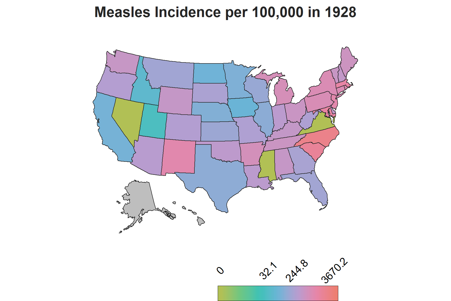
Since the dataset has data for each state by year, I decided it would be ideal to use a chloropleth map with gganimate to show how the incidence rate varies by each state over the years. The usmaps package provides one of many options to display state level data on a US map, which can also be done using the spData package, however with additional steps to include Alaska and Hawaii.
Create a FIPS column using fips() from usmaps package
The usmaps package has a fips() function that outputs the FIPs code for a state name string input. To have the state level data plotted onto the map, a FIPs column corresponding to each state needs to be created.
#Create a FIPS column using the fips() function from usmap
measles$fips<-fips(measles$state)
Create a new column to classify year by vaccine availability-will be used for subtitle in ggplot
There is another important piece of information to account for in the visualization to make sense of the changes in trends: vaccine introduction. The measles vaccine was introduced in 1963 in the United States with a second dose recomended by 1989. To show this on the map, I created a factor variable corresponding each year to three phases of vaccine availability: the time frame when there was no vaccine, the time frame when the vaccine was introduced and the years onwards when the second dose was reccomended. This column will be used as a the subtitle on the map to demonstrate the trends relative to vaccine availability over the course of the years.
#Create a column to classify year by vaccine availability
measles$vaccine<-ifelse((measles$year>=1963) & (measles$year<1989),2,
                 ifelse((measles$year>=1989),3,
                 ifelse((measles$year<1963), 1,1)))
measles$vaccine<-recode(measles$vaccine, '1'="",
                                     '2'="Vaccine introduced",
                                     '3'="Second dose recommended")
Creating quantiles for gradient breaks
measles %>% select(incidence) %>% summary()
##    incidence
##  Min.   :   0.0000
##  1st Qu.:   0.3458
##  Median :  27.7595
##  Mean   : 166.6918
##  3rd Qu.: 226.1823
##  Max.   :2964.4269
##  NA's   :64
If you take a look at the summary stats for the incidence in the measles data, you can see how variability between the rates would unevenly polarize rates above and below the third quartile, which would obscure interpretation of the rates on a gradient scale. Instead of using the default scale in scale_color_gradient() in the ggplot2 package which creates breaks by evenly spacing the intervals, quartiles are a better quantification of breaks in the dataset. a breaks vector is created to be read into the’breaks’ argument of the scale_color_gradient() function in the plot.
#Quantile breaks for gradient scale
breaks<- quantile(measles$incidence_rounded, probs=seq(0,1,.25), na.rm=TRUE) %>% unname() %>% round(digits=1)
Display
A few other things I added here in my code is a vector for a manual gradient color scheme and the resolution for the plot .gif file.
#Color palette
gradient<-c("#B1C055","#6CC682","#39C2B6","#6BB4D7","#B69DD1","#E685A8","#ED7F72")

#Set these image quality options
options(gganimate.dev_args = list(width = 6, height = 4, units = 'in', res=300))
Create the plot
#Create the plot
measles_plot<-plot_usmap(data=measles, color="#262626", size=.3, values="incidence_rounded")+
theme_void()+
scale_fill_gradientn(colors = gradient, trans="pseudo_log",
#The pseudo_log allows for log transformation even though 0 is in the dataset
na.value="grey",limits=c(min(breaks), max(breaks)),breaks=breaks[c(1,3:5)], labels=breaks[c(1,3:5)])+
#only including min, 50th, 75th and max values
guides(fill = guide_colorbar(title="",
                               frame.colour = "black",
                               label.position="top",
                               barwidth = 8,
                               barheight = 1,
                               ticks=FALSE,
                               keywidth=15,
                               label.hjust = 0.5,
                               label.vjust = 0.3,
                    label.theme = element_text(angle = 45, size=10)))+
  labs(title = "Measles Incidence per 100,000 in {frame_time}",
       subtitle="{unique(measles$vaccine[measles$year==(frame_time)])}")+
       #Allows for vaccine column to display as a subtitle relative to plot animation
  theme(legend.position="bottom", legend.justification=c(.8,0),
        plot.title=element_text(face="bold", size=14, color="#262626",hjust=.5),
        plot.subtitle=element_text(hjust=.5))+
   transition_time(year)
Save
anim<-animate(measles_plot, nframes=76, fps=1)
#76 frames because 76 years
anim_save("measlesmap.gif", anim)
#save the map
The Map